



The studio,
itself.
The practice behind the client work needed the same treatment the client work gets: a mark, a system, and a site built to the standard it sells.
One identity, every surface it has to survive.
A brand is not a mark, it is a set of decisions that has to hold on a poster, a postcard, a phone, and a business card at the same time. Change the route and watch every surface answer at once.
Quietly
built.
TWO COOL · SOUTH FLORIDA
A logo is the smallest part of a brand.
@twocooldesignDesign that wins the client.
See the workNine out of ten postcards are thrown out before they are read. This one has one job.
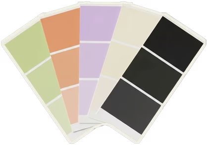
Every surface reads from the same four tokens. Nothing here is restyled by hand.
The practice, from the mark out.
If the identity cannot survive being used by somebody who did not design it, it was decoration.
DESIGN PRINCIPLEThe studio publishes what it knows.
Six specimens, written for founders rather than designers. The index is the marketing: it argues the position instead of asserting it, and it is the reason a first message arrives already convinced.
- 001COLOR Why warm neutrals outsell cool grays in premium brands
- 002SOCIAL The small brands winning Instagram stopped posting like brands
- 003BRANDING One identity, six surfaces. How a small brand outscales its budget
- 004UX Customers come back five times before they buy
- 005TYPE Custom type is the last real moat left in brand design
- 006STRATEGY The 80/20 of a brand launch. What actually moves the needle
Six live studies on twocooldesign.com. Titles link straight through.
The studio gave away the first hour.
Groundwork asks the nine questions Two Cool asks at the start of every identity, except nobody has to book a call to answer them. You choose between real palettes, real type and real material, a direction board builds as you go, and the brief is yours whether you ever speak to the studio or not.
Lay the groundworkNINE CHOICES · ABOUT FOUR MINUTES · FREELive, and carrying the work.
The site is live and the system runs everything the studio puts out: client decks, proposals, social, and the case pages themselves.
It is also the honest test of the offer. A studio that cannot hold its own standard on its own brand has no business selling one.